

A 2-year journey of untangling 20 years of legacy, scale, and complexity
NetCom Learning Website Redesign
Overview
When I joined NetCom Learning in November 2021, the website already carried a long history.
It was a 20+ year old company, a Microsoft Learning Partner, and a well-known name in enterprise training. But the website did not reflect that credibility at all.
What I saw instead was a product shaped by time, not intention.
Over the years, multiple teams had tried to redesign the website. None of those attempts fully succeeded. Each redesign added something new, but nothing old was ever removed. As a result, the website slowly turned into a patchwork of different eras.
On my very first audit, I found three different design languages coexisting across pages. Some pages looked like they belonged to the late 90s. Others felt mid-2000s. A few were relatively modern. Navigating from one page to another felt like jumping between different websites.
At the same time, the tech stack was outdated PHP with static templates and the CMS tools were fragmented, working in silos with no visibility into how content was structured or connected.
Before thinking about UI, it was clear to me that this was not a “redesign” problem.
It was a system problem.

Understanding why previous redesigns failed
Before proposing any solution, I wanted to understand why this had failed so many times before.
The reasons became clear very quickly:
-
There was no single UX or IA owner
-
Design decisions were reactive, not systemic
-
Teams worked in silos (marketing, course management, innovation, dev)
-
The CMS and data models were never redesigned alongside the UI
-
New designs were layered on top of old structures instead of replacing them
Every redesign focused on visuals. None addressed information architecture, content flow, or scalability. That insight shaped how I approached the project.
Setting the direction
I started by aligning with the CMO and the innovation team.
The expectation was clear:
-
The website needed to feel modern and credible
-
Marketing should not depend on developers for every change
-
The system should scale for hundreds of courses and certifications
-
The tech stack needed to move to Next.js and Python
-
The CMS needed to support dynamic, reusable templates
Instead of designing pages, I decided to design rules.
Rules for layout.
Rules for hierarchy.
Rules for components.
Rules for content.
Only then could 12+ templates and 1000+ pages coexist without collapsing again.
Research and audit: Seeing the real problems
I conducted a full UX audit across hundreds of pages. What stood out immediately.
No consistent spacing or alignment
Typography hierarchy changed from page to page
Buttons, forms, and CTAs had different styles everywhere
Navigation was overloaded and confusing
Course discovery was unnecessarily hard
Mobile experience was an afterthought
Lead flows were inconsistent
From the CMS side, things were worse.
Multiple tools managed different templates. None of them talked to each other. There was no way to understand how content flowed across the site. Even simple updates required developer support.
Stakeholders confirmed this pain clearly:
-
Marketing felt the website looked outdated and hard to manage
-
Sales felt users struggled to find the right courses
-
Course teams had no confidence in data accuracy
-
Developers were overloaded with content requests
-
Websitr
Goal
Create clear entry points for Rental and Subscription so users choose intent fast.
Shorten time-to-booking by prioritizing search-first interactions.
Surface pricing plan details at the right time to avoid surprises.
Improve post-booking clarity to reduce support and improve customer confidence.
Introduce a pragmatic design system to ensure visual consistency and faster implementation.
My Role and Collaboration
I led end-to-end UX: discovery, information architecture, interaction design, visual design, prototyping and handoff. I worked closely with the Product Manager to prioritise scope and with Engineering and Ops to validate edge cases such as delivery windows, restricted regions and refund timelines. Implementation required tight QA on payment states and map behavior.
My UX Design Process
Collaborated for discovery and heuristic audit to document funnel drop-offs and top usability issues.
Competitive benchmarking of mobility platforms to extract proven search-first patterns.
User journeys for Rental and Subscription personas, including the post-booking touchpoints.
Mobile-first wireframes with progressive disclosure for complex pricing.
High-fidelity UI and a compact component library (cards, chips, bottom-sheets, form controls).
Handoff and release validation with annotated specs and QA checks.
UX strategy: decisions that guided the design
Separate product mental models
Present Rentals and Subscriptions as distinct paths to reduce decision friction. This immediately simplified the user’s mental map.
Search-first entry
Make city + date/time the single primary action to get users into the flow quickly.
Progressive disclosure for pricing
Show plan tiers and add-ons at PDP and booking-summary stages, not on initial search. This reduces perceived friction.
Operational clarity baked into UX
Deliverability, return location, required documents and invoice states are surfaced where they matter to avoid support escalation.
Pragmatic component system
Tokens and consistent controls eliminate cross-platform variance and speed up engineering.
Andriod and iOS App Design solutions and implementation
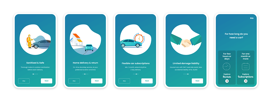
Onboarding: Setting expectations and guiding first-time users (mobile onboarding UX)
The onboarding flow introduces new users to Revv’s value proposition before they reach the rental or subscription funnels. Instead of overwhelming users with features, the onboarding emphasises trust, safety and convenience, which are the biggest decision drivers in mobility products.
Rentals flow: Selecting city, time and scanning available cars (search UX for mobility products)
The Rentals flow begins with a streamlined search model that prioritises the two decisions users make most confidently: where they want the car and when they need it. By separating city and date inputs into a clean, mobile-first pattern, the flow removes the friction that previously came from cluttered fields and overlapping promotions.
The redesigned Rentals flow reduces cognitive load at every step: from selecting the city and time to scanning available cars. By presenting information in a predictable order and keeping filters within reach, users complete their search faster and with fewer dead ends. This directly supports the booking funnel and improves decision confidence.

Car details and booking configuration — from PLP to PDP (pricing plan UX and booking configuration UX)
After selecting a city and dates, users land on the Product Listing Page (PLP), where they browse all available cars for that location. The redesigned PLP and PDP sequence focuses on clarity, comparison and progressive decision-making, ensuring that users never feel overwhelmed by pricing or configuration choices.
This redesigned sequence reduces friction between interest and commitment. By structuring decisions, enabling easy modifications, and surfacing pricing clearly, the flow increases conversion while reducing downstream customer support issues. It turns booking into a guided, confident process instead of a confusing multi-step task.

Payment and checkout: Reducing friction and building trust at the final step (payment UX optimization)
The payment flow is the final, highest-stakes step of the booking journey. Users must feel confident, protected and in control. Our redesign focused on clarity, error-proofing and progressive reassurance so customers could complete payments without frustration or confusion.
This redesign made checkout significantly more reliable and predictable. By adding progressive validation, better grouping of payment options and visible security reassurance, the flow reduced user hesitation and abandoned checkouts. It provides a sense of momentum toward completion, which is essential for any transactional mobility product.

Post-booking experience — supporting customers from confirmation to return (post-booking UX & operational alignment)
Once a customer completes the payment, the true service experience begins. Most issues in mobility rentals appear afterbooking: uncertainty about delivery time, lack of clarity around documents, confusion about refunds, or not knowing whom to contact during delays. To address this, I worked closely with the Product Manager and the Operations team to map the end-to-end operational workflow and convert it into a transparent, user-facing experience.
The redesigned post-booking flows give customers ongoing visibility into every part of their booking, from preparation to delivery to return, turning a previously opaque process into a predictable and reassuring journey.

Impact
The redesigned Revv booking ecosystem strengthened the entire rental experience end to end, improving conversion, operational efficiency and customer confidence. By clarifying product entry, simplifying search and pricing, and introducing transparent post booking states aligned with real operational workflows, the new UX reduced support dependency, lowered delivery and return failures, and created a more predictable checkout flow.
Customers gained clarity at every step from selecting a car to tracking delivery and viewing invoices while internal teams benefited from fewer disputes, fewer repetitive calls and a more consistent design system. The result was a faster, clearer and more trustworthy rental journey that supported both revenue growth and service reliability.
Want to fix drop-offs in your booking or subscription flow?
If you’re building a car rental, mobility, or subscription-based product and your users struggle with pricing, plan selection, or completing a booking, I can help. I work as a freelance UX & Product partner to redesign booking journeys, clarify subscription options, and improve conversion across mobile and web apps.